12 November 2010

Labels

Oh my goodness. I never put anything here! But, then, I haven't been doing much design work lately. All that has changed, though, as I have a gig with a restaurant working on stuff for them. Packaging. Menus. T-shirts. Everything!

Here is something I've been working on. Moving towards something I think is better. Maybe? Still not there yet. But feeling closer.


I think I might try putting stars instead of asterisks. Trying some different color schemes. This place is fun and their label should be, too! I'm trying to find all the info on the nutritional labels. Haven't actually touched that from the file they gave me to begin with. Anyway. I'm kind of excited where this is going.
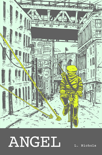
24 February 2010

Angel Cover

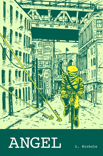
Been working on a cover for my graphic novel that I've been writing. Had the thumbnailed idea for a while, and finally sat down yesterday and drew the mofo. Marathon drawing, for sure! Actually, I've gotten a lot faster than I used to be. From pencils to completion, only around 3.5 hours.

I did a bunch of color combinations and then asked a bunch of people what they thought. Apparently they think like I do because this is the one with the most votes.

AngelCover1sm

And this is the one with the second most votes

AngelCover7sm

09 September 2009

T-shirt design

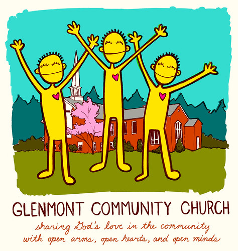
I was recently asked to design a t-shirt for this church up in upstate NY. The pastor there had seen my bulletin covers that I did for Greenpoint Reformed Church and really liked them so wanted me to do a t-shirt for them in that vein. Here's what we finally decided on. It will be printed on a cream colored shirt (hence the cream background). I'll try to get photos of the actual shirts once they get them.

Glenmont Community Church T-shirt design

28 July 2009

I mentioned in class last week that I had some posters and a banner to make as a favor for some friends and their rock camp. I've been packing my house up like crazy since we're moving next week, and also since we're flying to Seattle on Wednesday morning at the crack of dawn. All of that together didn't leave too much time to make said posters and banners, but I took the better part of this evening and gave it my best shot.

Try 1. I thought this was a little stiff. After this, went in a different direction:
BEA Flyer 1

Try 2. Thought that maybe illustrations more like I've been doing on my project would work for this. Decided to stick with this style:
BEA Flyer 3

Try 3. Different illo:
BEAFlyer4

Try 4. Adding some color:
BEAFlyer5

Try 5. Playing around with colors. Liked this better than the one before:
BEAFlyer6

So then I ran with those last colors and made a banner kind of putting everything together that I liked from before:
BEABannerSmall

22 July 2009

To date

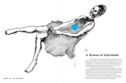
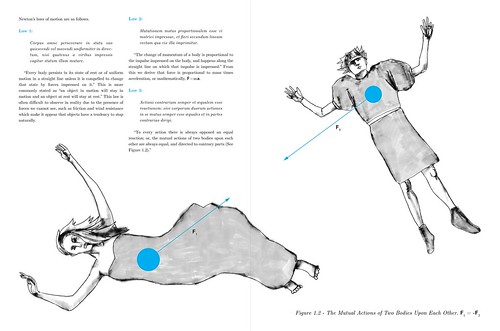
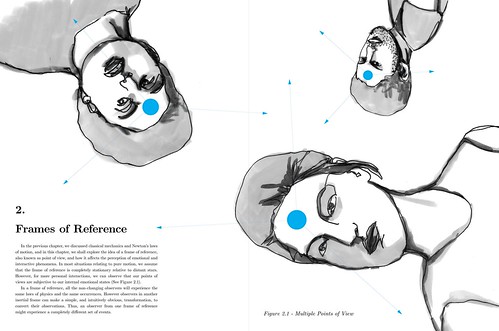
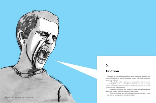
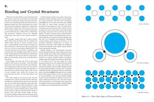
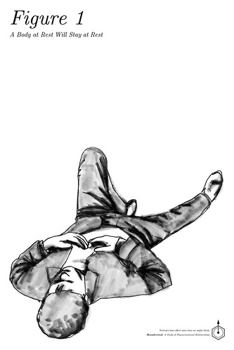
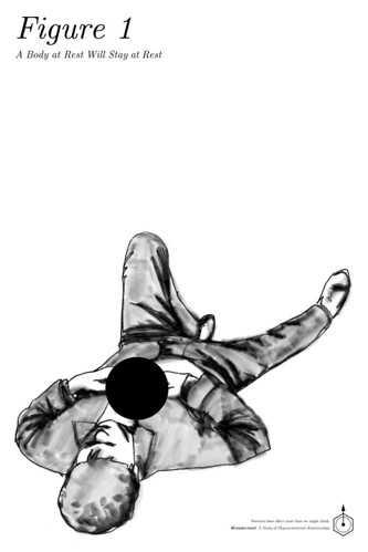
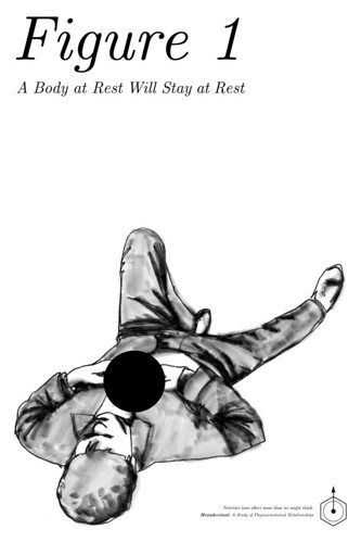
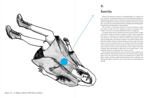
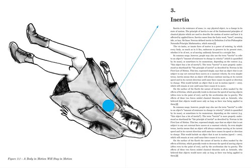
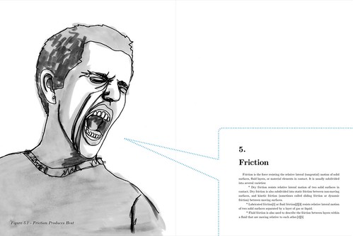
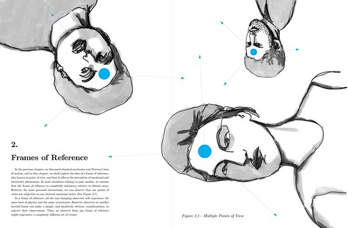
NB: Still trying to figure out friction spread to get more of a feel of friction. For now, it's as it was. For now, most copy is just copy/paste from various things.

Hexadecimal-spread2-5

Hexadecimal-spread3-3

Hexadecimal-spread4-4

Hexadecimal-spread5-1

Hexadecimal-spread6-3

Hexadecimal-spread1-4

zine

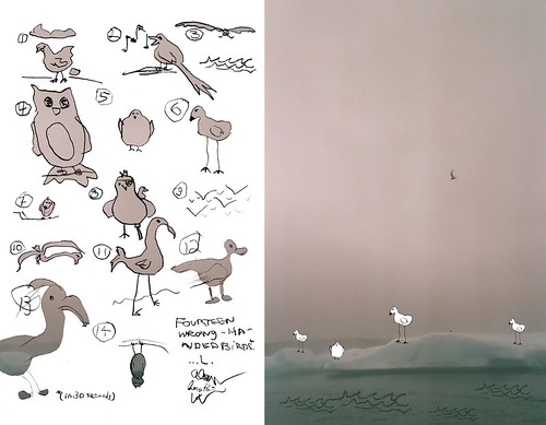
I also worked on this bird zine a bit more. You can click here for the LoRes pdf

HiRes pdf here
.

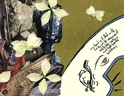
Here's a couple of spreads I reworked, trying to take your advice and work the colors/etc from one side of the page to the other a little more.
page12-13 copy

page14-15

Poster

Trying to find a happy medium on the type size.
HexadecimalPoster1-5

15 July 2009

And on a completely different note

I've been working on compiling and working together this bunch of things my friends and I made several years back all having to do with birds. If you want to see what I've done so far, you can click here for the LoRes pdf. There is HiRes pdf here. LoRes is probably better for your download times, though.

page10-11

Posters

I also figured I'd jump on the b/w poster bandwagon. Here's the first results of me playing around.

Try 1:
Poster - try 1

Try 2:
Poster - try 2

Try 3:
Poster - try 3

And I know you said black & white, but I thought I'd play around with just one color.
Try 4:
Poster - try 4

Try 5:
Basic CMYK

Hexadecimal Symbol

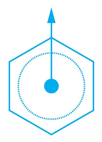
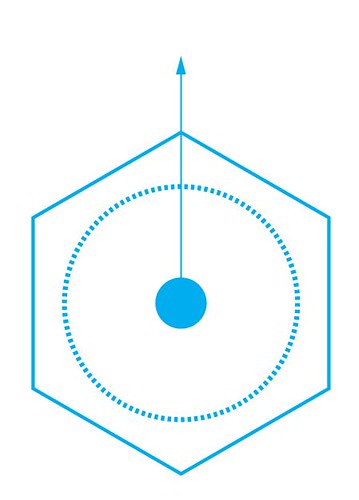
Was thinking about this project while walking somewhere the other day and was wondering if there was a symbol I could figure out that would represent it somehow. I thought that a hexagon might be a good place to start (even though hexadecimal is 16) for its connections with chemistry (aromatic rings) and materials (honeycombs, hexagonal close packing crystal structure). The dot and arrow are a vector acting on a center of mass. Also the dot is a symbol for a decimal. Thought I would keep it visually simple like the rest of the project seems to be going. Maybe I'll try to do some more variations on this later.

First try
Hexadecimal

Second try, changing line thickness
Hexadecimal 2

Spread 3 variations

Trying to figure out a layout for the spread. For now, the copy is just filler. I'm still working on the actual stuff.

Hexadecimal-spread5-1

Hexadecimal-spread5-1

Hexadecimal-spread5-1

09 July 2009

spread 5 variations

First draft:
Hexadecimal-spread4-4

Second draft:
Hexadecimal-spread5-1

spreads

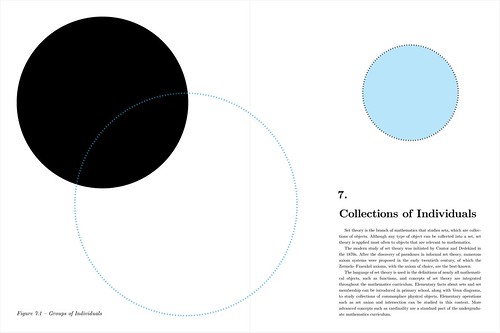
NB: the friction spread and the group/sets spread are just rough rough drafts. I figure I should make rough drafts of the stuff I have planned so far and then work on them over this week. Still a lot of copy to write. For now, it's just copy/paste from various things.

Hexadecimal-spread2-5

Hexadecimal-spread3-3

Hexadecimal-spread4-4

Hexadecimal-spread4-4

Hexadecimal-spread2-5

Hexadecimal-spread1-4