Spread in progress
Trying to give things some order. Still a lot of work to do.
![]()
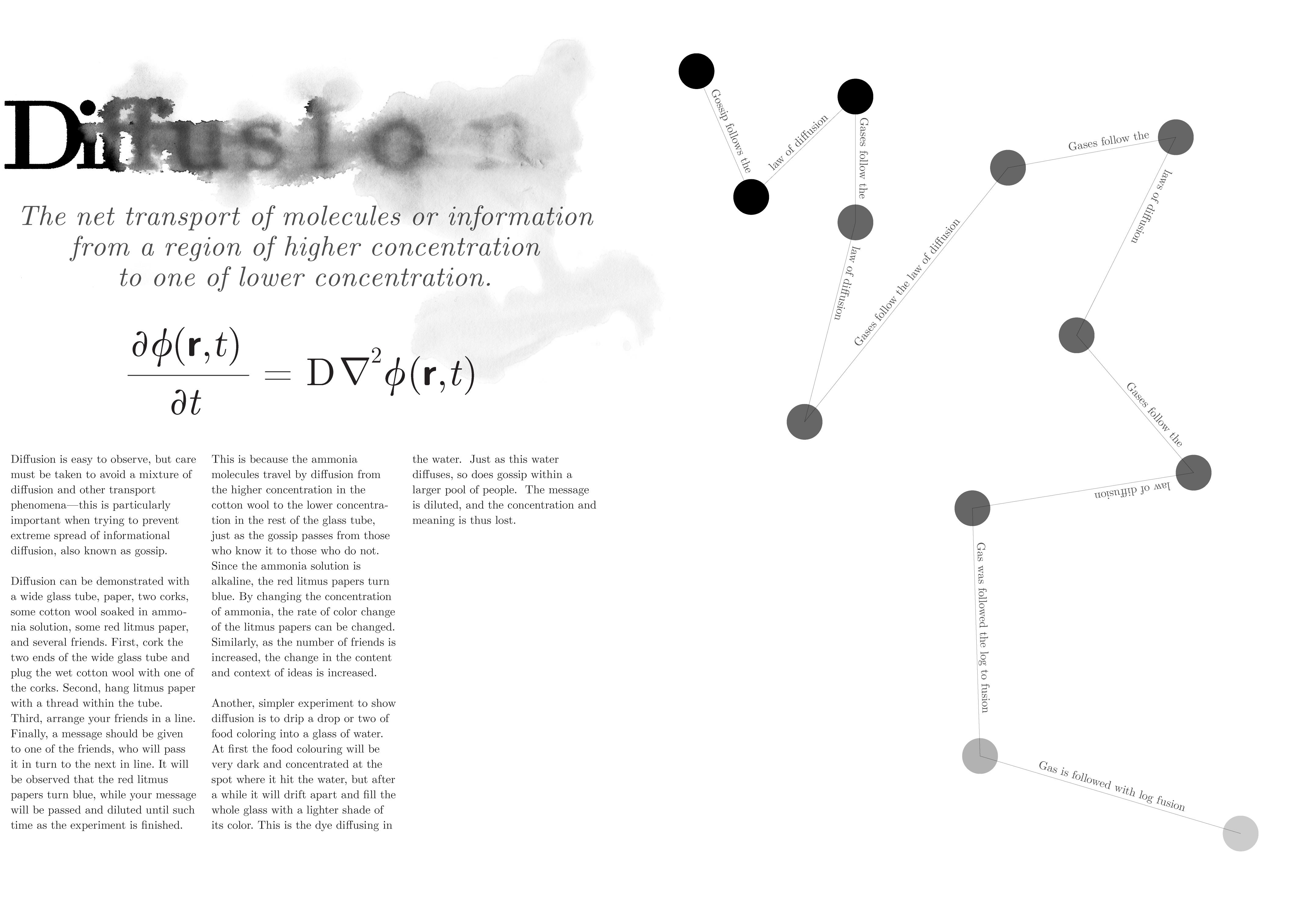
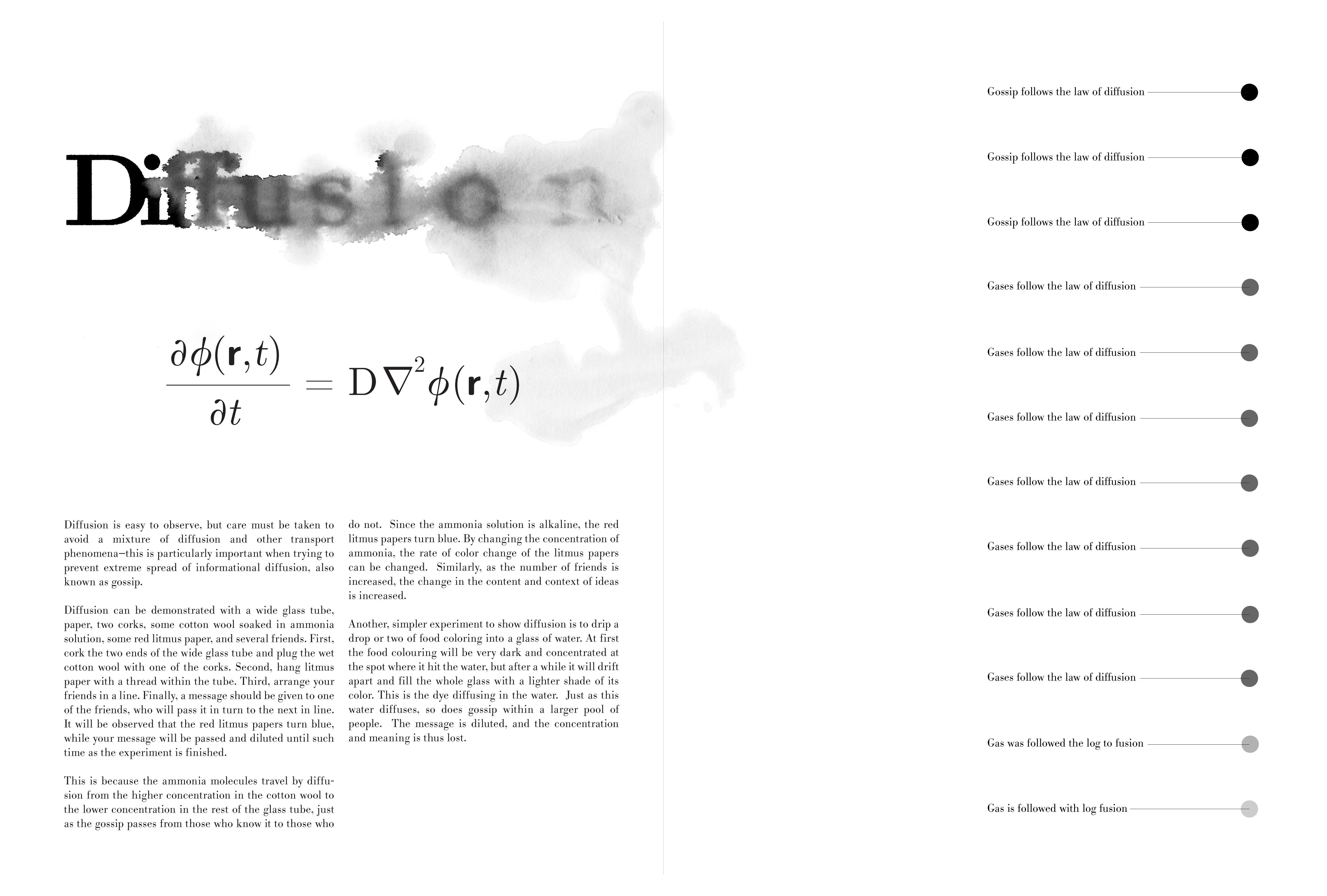
Working on this. The graphic on the right is a representation of a game of "Telephone" I played with 12 people passing the message "Gossip follows the law of diffusion". I was trying to show how it mutated. Am still playing around with this. So if you have any suggestions, let me know. This is a sort of mid-process snapshot of what I'm working on.
(also, the margins got cut off a bit exporting as a tif, so just trust me that there are a bit more margins on the printed out physical version)
![]()
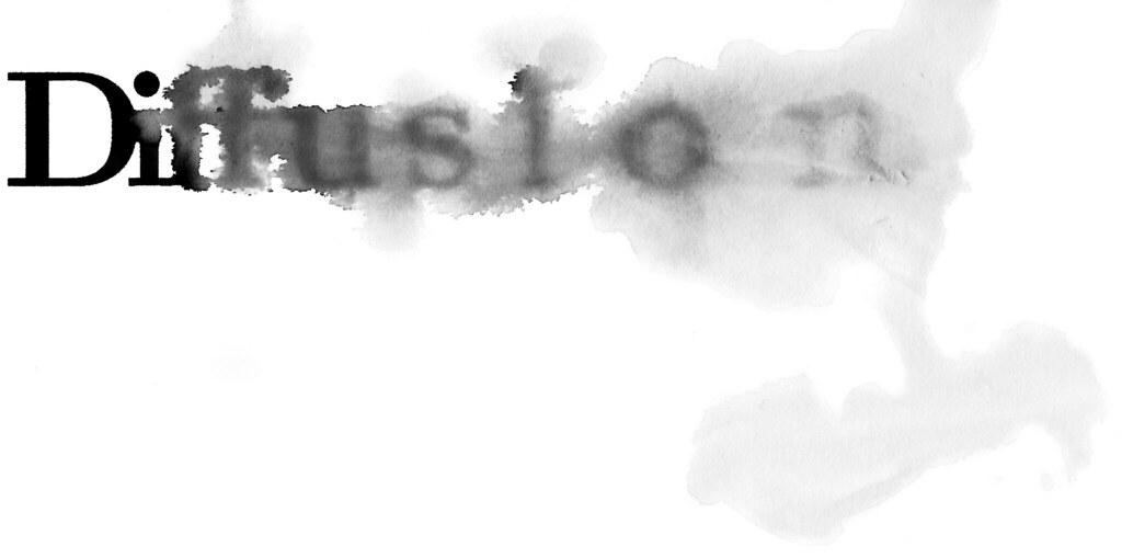
Taking type and doing some physical processes with it after printing it out. This is diffusion at work -- sandpaper then water. Both color (the actual colors it separated out as) and b/w.
![]()
One thing I remember well from my years studying science and math is how most of my problem sets and most of the technical papers I had to read all looked the same. This is because a vast majority of stuff is written using LaTeX, a program that basically typesets everything for you after you write it all using something akin to HTML mark-up (only with LaTeX code) on plain text. LaTeX makes is super easy for anyone to write equations and formulas, which is why it's so popular. Scientists/engineers/mathematicians don't like getting frustrated with things like formatting, so it makes sense to have a program that will pretty much just format it for you.
Anyway. I was thinking about type in relationship to my thesis, and I was trying to figure out what this seemingly ubiquitous typeface I saw was. So after some internet poking around, I found out that it's Computer Modern Unicode. Comes in a variety of weights. Serif and sans. Small caps. Itals. Plus a whole slew of glyphs: Greek, math, Cyrillic, etc., etc.. It was originally made using the METAFONT system (but has since been converted to TT and OT) and was intended specifically for computers and LaTeX/TeX. The range of CMU makes it pretty ideal for math, since it has all the symbols that you could possibly want.
Long story short, I found a download for the typeface and decided to play around with it. It's not necessarily the most elegant font, but what it does have is a whole host of connotations that anyone familiar with reading math/science papers will see and recognize.
![]()
Trying to figure out how to simplify and arrange things on a page. Still a very rough idea.
![]()
I had a very long/busy week last week due to the MoCCA Art Fest and then on Sunday, I discovered that I was sick. BOO. Exhaustion + allergies? Nerd flu? But I've been trying to persevere.
Here's the first piece I have sort of done. I've been wishy washy about where to go/afraid of starting (I think I find large paper intimidating?), so I just decided to start and see where it went. More will come tonight/tomorrow.
This is a photographed then photoshopped image (mostly just curves and the burn/dodge tool). But... I almost think I like the photoshopped version better. Something nice about the way things were captured and lost? I don't know.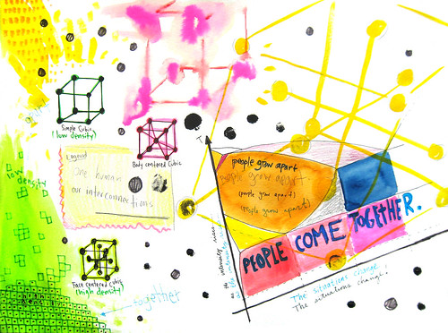
![]()
I've been trying to sort out my ideas a bit more into a more concrete form. This is hard for me 1) because I'm not very good at putting my ideas into words to begin with and 2) I haven't had to do this in a long while. It's good for me, though, I guess.
To answer your comment, Gen, you're right. I need to be more precise with my language. And, also, I need to narrow things down to a concise 10 week plan. So here goes.
While in PA this past weekend cleaning the fish that I caught, I had a long opportunity to think (for some reason, keeping my hands busy lets my mind think) about this project. Mostly about trying to figure out something more specific about what I want to do. And I had some ideas, but I'm not sure how to explain them. I'll do my best.
*****************
I think I would like to make a book. I like books. I can't really explain completely why... just some combination of memories from childhood and the joy of holding/experiencing them. Something about the way they're one object with many facets. I don't know. I just have a love for books that I don't have for many other things and I feel that if I'm going to spend 10 weeks working on one thing, it better be something I'm passionate about.
But if I'm going to make a book, I don't want it to be some saddle stitched small thing like I usually do... I want to make something more substantial, something nice. And I want it to have a range of things design/graphic-wise all around some central theme. Nothing story-like... I've done enough of that. But something more like... theme and variations?
So for the theme, like I tried to say earlier, I am interested in this duality of rationality/irrationalty. Or logic/emotions. Words/pictures. Etc. etc. I'm also interested in figuring out ways to express more abstract, emotional, experiential concepts like faith, hope, love, happiness, sadness, etc. I guess that's more like two themes that are sort of intertwined. But that's still not something specific or substantial. So maybe I should give some ideas of what I was thinking:
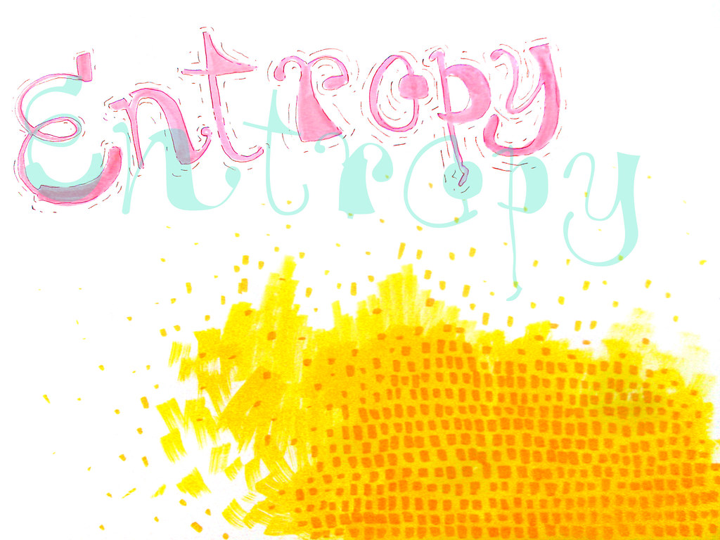
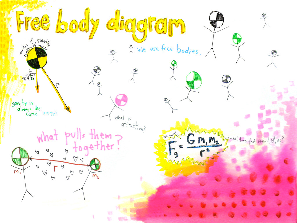
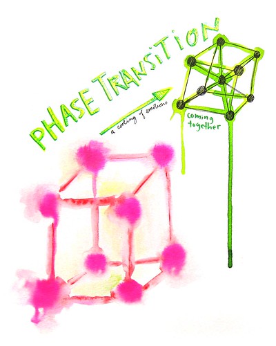
* Taking ways that are normally used in science/technology/math and using them to talk about irrational/emotional/experiential things. So... taking something that visually cues "information" and giving the viewer something other than information.
*Example: taking the visual form of an infographic and turning it into something non-"informational" but still with a topic/story/subject that fits in with the theme (the gray area of the duality of rationality/irrationality)
*Example: taking the visual form of a map/blueprint/circuit diagram and using it to tell something more of an emotional-based thing. Blueprint of an emotional state?
* You know how sometimes books have transparent overlays that have line drawings on them that further explain things like technical specifications of the picture below? Doing that in some type of reverse where the image is on the transparent page and the page to the right and the left of the transparent one have the line drawings that change how the image is read. Two different ways to read the same image. Maybe one more subjective (right side of page -> right side of brain?) and one more logical/informational (left side of page?)
* A pocket in the back of the book with a map and other things? Something large that folds out?
So, yeah. Those are some ideas I had. Basically, I thought the theme of the book could be discussing rationality vs. irrationality and that the way I did it could also be using those same ideas to mix the two. And I figured since it is potentially something to show off my work, that maybe it should use some of the graphic ways of doing things that I would potentially be using but instead of the usual content, having the content fit with the theme.
As for a plan of attack... I guess I could try to do several spreads/wk, starting with things I have a clearer idea of and growing off of that? Or I could try to plan with a bit more structure? I don't know how much I can plan, though, without just starting and working. I was just going to work my ass off until it was done.
![]()