skip to main |
skip to sidebar
the design blog of l. nichols
About Me
Subscribe Now: standardSmall
Labels
- comix (14)
- constructionism (14)
- scotland (12)
- wormulus (11)
- comic collaboration (9)
- navan.ghee (9)
- art (5)
- comics (5)
- thesis (4)
- 52 comic challenges (2)
- actus (2)
- elvis comic (2)
- entr'actus (2)
- steampunk (2)
- type book (2)
- CD cover (1)
- CD package (1)
- Didot (HFJ) (1)
- SVA (1)
- book cover (1)
- graphic design (1)
- kits (1)
- photos (1)
- portfolio (1)
- random (1)
- summer portfolio (1)
- tetchy (1)


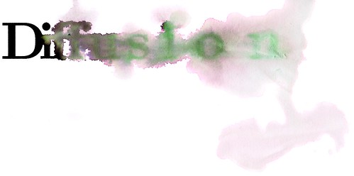
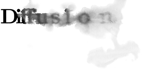
I like the idea of combining this image with the "definition" below, different ways of looking at diffusion. As for the typeface itself, if you don't think it sets beautifully (and I can't really tell on the computer screen) maybe you could use something that you think it equally clean and accessible. Keep the glyphs but set the rest in something you like a bit better.
ReplyDelete